Argument with Self

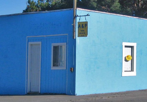
Why are you posting this photo on your blog? It’s boring and lame. It looks like something out of a real estate magazine.
Man, you just don’t get it. The beauty of the photo is in its simplicity. The entire building is a bright baby blue, with a shadow perfectly darkening one half.
So what? There's a skit on Letterman in which an act comes out and they have to decide if it’s “something” or “nothing.” The photo above is “nothing.”
Maybe so, but for some reason I think it’s interesting. Not great by any means. Just interesting.
It looks like you’re over saturating the colors. This seems to be a trend in your photos. That’s kind of amateurish, if not downright childish.
I’m guilty as charged. But in this case I changed the color saturation very little. Besides, sometimes the increase in color saturation simply makes the photo look more like the real thing. When the human eye views a scene, the colors “pop.” But when it’s transferred to a digital or film image, the colors are dulled. So adjustments are in order.
You're over doing it.
I can't help myself, but I will try to be more conservative. I just can't make any promises.
I think you should have deleted this photo. By sharing it on your blog you risk the chance of embarrassing yourself.
Why should I start worrying about that now? I’ve tossed all sorts of material on this blog that I probably shouldn’t have. Remember, this is a “laboratory.” Some things here are just “experiments,” and sometimes experiments fail.
Kind of like this idea of debating yourself?
Exactly.
We’ll just have to agree to disagree on this photo. By the way, why didn’t you ever respond to Rose’s suggestion that you exhibit some of your photos in town?
Because it’s an idea I’ve been thinking about and I wasn’t ready to respond until the idea rattled around my head for awhile. I’m still thinking about it.
If you ever exhibit your photos, PLEASE don’t use the one above. I don’t want you to embarrass me.
I wouldn’t use that photo because I’m not even sure about it. Actually, the only photo I’ve taken in the last several months that I like is the old garage at the bottom of my recent “Trip to the Big City” posting.
I like that too. But there’s a high likelihood that other people don’t share our tastes.
That’s what would make an exhibit interesting.


2 Comments:
I like it.
Why?
I guess because it's just so blue. It's a very cool photo.
The old barn is nice too, and I also dug the red building at a weird angle with the brilliant blue sky. I'm surprised you didn't shoot any photos on your way -- there are so many amazing vistas out in the Bottoms.
Regarding your debate with yourself, if you start doing it out loud, well, you just might want to give yourself a talking to.
I like it too.
The timing of the shadow is brilliant. It's amazing how people will not see some of these natural occurances. Take the "Golden Hour" for example. My daughter now exclaims it when she sees it. "Look, Golden Hour"
With the advent of Photoshop in this era, It's nice to see actual natural occurances. I once witnessed this exchange.
"Wow, look what you can do with PhotoShop. I took this photo and by using Photoshop, I took the powerlines out of the shot completely." "How long did it take you to do that?" "Oh, a couple of days. It was quite an ordeal". "Why didn't you just compose the shot without the powerlines?" Silence.
Post a Comment
<< Home